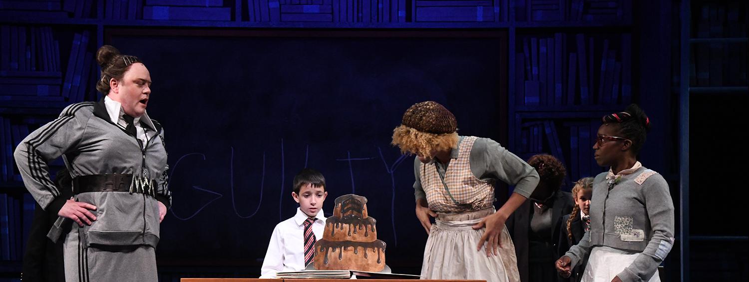
When I first heard that we were doing Matilda, I couldn’t help but make a mental list of all the unique and complex props that our department would get to make. At the top of that list was the giant chocolate cake poor Bruce is forced to eat. Garnering an entire chapter in Roald Dahl’s book and a famously stomach-turning scene in the movie, the cake had a lot to live up to.
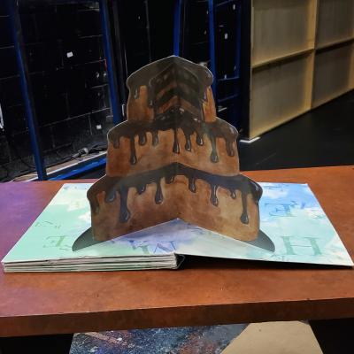
Instead of going the traditional route and making a giant edible cake, our director Peter Flynn decided to go in a different direction. Olney’s production takes place in a giant library and celebrates the power of Matilda’s imaginative storytelling. What if this fantastical cake came from a book? Peter wanted to explore using pop-ups as a way to communicate this moment. When the book is first opened, it would reveal the whole cake. With each successive page turn, the cake would get smaller and smaller.
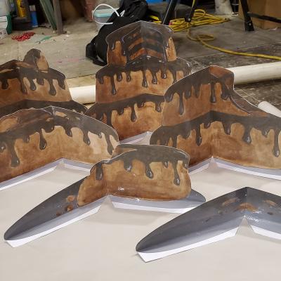
The cake pop-up book was one of the first Matilda props I worked on way back in early May. I wanted to figure out the mechanics of the book first, so I immersed myself in the surprisingly expansive online world of papercrafting. A v-fold mechanism seemed to be the best solution. Then I did some rough cake drawings and mocked-up a test book.
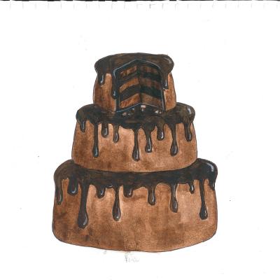
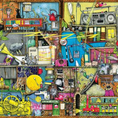
The creative team approved the action of the cake book, so I moved onto its design. Milagros Ponce de León, our scenic designer, was influenced by the quirky and highly detailed illustrations of Colin Thompson. Using his work as inspiration, I painted each iteration of the chocolate cake with watercolors. The paintings themselves were barely ten inches tall, so I scanned them into the computer, enlarged them in Photoshop, then printed them on our large format printer.
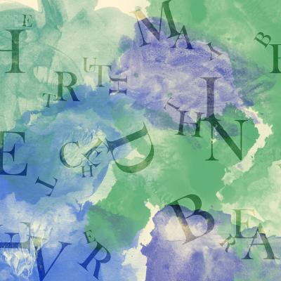
The bright white pages of the book looked jarring behind the cake illustrations, so it was decided to add some imagery. A traditional page of text didn’t quite fit the aesthetic, so Peter, Milagros, and I chose to liven it up by distorting the words and introducing color. Using Photoshop, I manipulated a collection of letters and overplayed scans of watercolor brush strokes. (A fun easter egg: the text on the pair of pages actually spells out a quote from Don Quixote: “The truth may be stretched thin, but it never breaks”)
Once the book was fully assembled, I added clear glossy contact paper to the illustrations to protect them from Bruce’s frosting-covered hands. For the final step, I made a simple cover to match the books attached to the set. Then it was ready for the stage!
