Alissa Klusky: I really appreciate you taking the time to sit down with me to talk about your incredible set design for The Music Man. Which, by the way, I love. I’m obsessed with it. To start off, can you tell me a little bit about your background as an educator and a designer?
Ethan Sinnott: I identify as a full-time artist who happens to work in higher education.
For much of my life, I have always had a strong pull toward articulating my imagination while inhabiting this weird identity limbo between Deaf and hearing worlds. I do remember very well the first time, as a child, my parents took me to the National Technical Institute for the Deaf to see a play with signing Deaf actors--it was A Christmas Carol with Patrick Graybill, one of the original members of the National Theatre of the Deaf, in the role of Scrooge. I thought it nothing short of miraculous--you have to understand, I grew up during a pre-ADA time when almost nothing was widely accessible. I gorged on comic books, watched formulaic TV series based on comic books and cartoons (such as Lou Ferrigno’s Hulk and Spider-Man and His Amazing Friends) where I could follow the basic plot absent dialogue, and my father would take me to the movies in the '80s and interpret for me the best he could--E.T., Harryhausen's Clash of the Titans, Superman II, The Never-Ending Story, The Empire Strikes Back, etc. The power of the image to create worlds and narratives resonated with me at an early age and it still does. As a Deaf person–I was born Deaf–-that's probably why I was attracted to theatre as a logical outlet and means of expression...out of a desire to communicate unimpeded, in my own way.
I didn't set out to be a scene designer--but to be a director, an artist working in theatre, and in some kind of “producer” role--and scene design was/is a means to that end. I just…fell into it, not long before Y2K. In many ways, being a scene designer has helped me cultivate a new dimension to my art, tied in with my childhood love for creating narratives through imagery, while allowing my work to speak for itself in such a way that--early in my career, and even today, periodically--forces potential collaborators to decide for themselves whether they are prepared to look past the fact that I happen to be Deaf or not, confront any hearing biases or privileges they may have internalized or not.
For the most part, mainstream theatre is synonymous with a hearing world which takes for granted the ubiquity of the spoken word to communicate...to filter...to process...to understand.
Picture a mainstream production with all its prerequisite visual components: scenery, costumes, lighting, choreography, projections, what have you. Hearing audiences experience psychological and tonal shifts and variations within the story through spoken dialogue, music, sound cues and effects, which allows them to sit through 2-3 hours of a show and remain engaged--that becomes all the more evident if the production is not Hamilton, or a Sondheim offering, or something similar, if the scenery is either bare or minimal, if a fixed unit set that does not visually change at all throughout the performance of a production.
I vividly remember an unnamed touring production from a few years ago that billed itself as a masterstroke of visual storytelling: in a twist of irony, several crucial sequences were over-reliant on sound design, which, from a visual standpoint, turned these sequences into hit-and-run stage tableauxes, momentum killers to my Deaf eyes as I found myself struggling to make sense of what exactly was going on. The Deaf part of me felt slighted, thinking, it cannot truly be called visual storytelling if sound design is being used to cheat through some parts, and my inner pragmatist was going, who is this production really for? Certainly NOT for someone like me.
Conversely, if a production is packed to the gills with competing visual elements, focal points in support of actor and action clarity are made more complicated for Deaf audiences--basically, we are being asked to make the effort required to keep up with the storytelling onstage, and by the time we cut through the clutter, the immediate impact of an important dramatic moment may have already passed--while sound design becomes the thread through which hearing audiences can navigate this type of production.
Those experiences have continued to inform me as a Deaf designer working in the mainstream seeking to create stage worlds that have the capacity and flexibility for continuous visual transformation without being too much or too spartan, as if self-aware of the random possibility of Deaf people being in the audience for any given performance. It's probably not surprising that expressionistic minimalism is my aesthetic of choice. Theatrical productions are not intended to be heard, or seen, but experienced in the most naturally intuitive ways possible: that distinction is crucial. We traffic in stories about our shared humanity.
Within the trajectory of my professional experience designing sets for the theatre, my creative collaborations have been with hearing people who had never met a Deaf person before and/or who do not know how to interact with Deaf people. I’m almost always the only Deaf person in the room for design and production meetings--with an ASL interpreter present--and everyone in that room comes in with their own respective life experiences, you know, but regardless of their identities, regardless of whether those identities are intersectional or not, they are nevertheless hearing. I also neither hear nor speak well enough to pass as hearing, so I cannot make myself any more palatable to others for whom hearing and speaking are comfort zones, thus guiding their creative processes. And asking them to adapt, meet me halfway, outside those comfort zones, well, whether they do or not has typically been an iffy proposition. Will this new way of doing things exhaust and inconvenience them to the point where they find ways to avoid working with another Deaf designer who does not hear or speak well enough? The production team's power dynamics have already been set ahead of the first meeting for any new upcoming production, and I am outnumbered by such a great margin that I find myself needing to tread carefully, mindfully, in spite of myself. This industry is built on, and defined by, access to people, with occasional exceptions. That has been my reality, and I need to choose my battles accordingly, with no less gratitude for allies who appreciate me enough to allow themselves to become uncomfortable in terms of our collaboration and communication as fellow artists.
In this situation, with Music Man, when I first came on board, I felt conflicted between excitement and cynicism: my cynic was like, this is going to be the latest staging with a disproportionate number of hearing creatives looking to score points for tokenism dressed up as a Deaf-hearing co-production? Conversely, my excitement about Music Man as a project--irrespective of my personal feelings about that story itself--was that, at its heart, it presented a major evolutionary step closer to a goal so many within the Deaf theatre and film communities have been fighting for: their casting as characters where Deafness is not a specific requirement, and with this production, not just single characters, but an universe full of them! This is routine practice taken for granted at Deaf undergraduate theatre programs at Gallaudet and NTID Performing Arts, but it has not caught fire in the mainstream yet. Hopefully, this Olney staging is the latest to represent the beginning of something seismic and sustainable. How would audiences' understanding of familiar stage characters such as Hedda Gabler or Willy Loman shift, or be challenged, if they were played by Deaf actors instead? There is so much yet to be mined here.
Much of my work has been an ongoing exploration into what it would mean to create uniquely Deaf-oriented equivalencies to standard mainstream theatre experiences, shifting the default sense used to filter, process, and understand from hearing to sight. For example, due to their expressionistic nature, the haunting Varsouviana polka sound cues in A Streetcar Named Desire could be converted into Blanche's recurring hallucinations of her dead husband in happier days, if this play was produced primarily for Deaf audiences. The dramatic impact would be equal, but through different navigational modalities as humans. These variations are logical and organic extensions of a hypothesis I have carried around in my head ever since I started working in theatre: what if the human species was and is uniquely Deaf to begin with, and how may that have impacted theatrical developments familiar to us?
Fast forward to today, and this is probably the first time in my professional career that a Deaf-hearing co-production, with healthy Deaf representation across the board on stage and behind it, has lived up to its billing in words and deeds within a fully mainstream context and setting.
My expectations as a Deaf designer working in the mainstream are simple. No interminably protracted periods of visual inertia. No visual stagnation. Generate potential for visual rhythms and shifts achieved by scenic, lighting, and/or projection means. You're seeing all of that in Music Man.
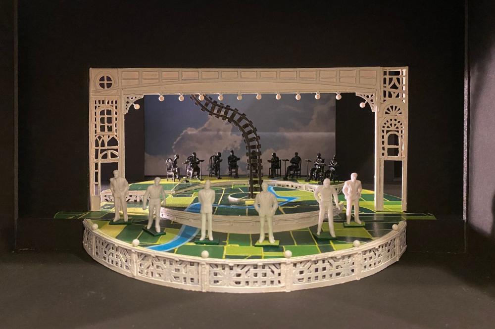 Image credit
AK: Let’s talk more about that Deaf-centric vision. In our set, River City’s “town square” is actually a town circle. Can you talk more about how the idea of Deaf input in city planning led to this choice?
ES: As one who is Deaf, I view the idea of a conventional, literal, and traditional town square as a recurring metaphor for the hearing world, a subtle reminder that we as Deaf people live in communities, societies, and worlds largely predicated by the ability to hear.
What is in a square, a rectangle, the building blocks of conventional American urban design? Hard lines. Hard angles. Sharp edges and corners. Mass and weight. Lightening, organic, and softening details and effects are less frequently applied. Almost every city and town that has been designed and built thus far is a potential gauntlet of blind spots and sight line obstructions to the average Deaf person navigating it, but the same could be true for other hearing people as well. When we look at the urban design of the average city or town in today's America--or anywhere in the larger world--it is abundantly clear that the Deaf influence ("Deaf Gain'') is virtually nonexistent.
If such a city or town was shaped according to Deaf sensibilities--or sensitivity to those--immediately from the start, its two defining traits would be 1, least restrictive environment, and 2, maximum visual access in all directions. More likely than not, a Deaf dwelling would be recognized by an open main floor plan unifying its kitchen, dining, and living areas, with distance being no impediment to sign language conversations taking place.
In this world of this Music Man, we have Deaf and hearing people choosing to live as one community--River City--as harmoniously and naturally as could be, an ideal much more based in fantasy than in reality, and not necessarily utopian, too. So I really had to think about: not only what would such a world look like physically, but how it would feel to navigate it as authentically as possible.
Early on in the design process, during a series of rehearsal workshops, I gravitated to a work by Deaf artist Chuck Baird, "The Sign." Initially, I thought it was because of the spiral arrangement of rectangles and squares swirling around and above hands ("signs," "sign language"), and I had this mental image of windows, doors, and signage rigged to float, hang in space, and lift/descend as a homage to this work. But over time, a logical gap between this image and the needs of this production grew. I came to the realization that it was not the literal composition I was responding to, but the psychological lightness of being conveyed by the painting...the lightness of being Deaf, the lightness of being human.
More than less productions of Music Man default to Grant Wood paintings as backdrops, but again, early in this process, I was drawn more to the works by his regional contemporary, Thomas Hart Benton. Wood is mass and stolidity, and from my standpoint, his stuff convey a feeling of being anchored--stuck, trapped, not too dissimilar to the historical experiences of lone Deaf persons living in insular hearing communities, feeling more alone and stigmatized than included and validated. Conversely, Benton is air and energy, and his rural landscapes have a musicality to them, as if living is a choice to be made over existing, and amid circumstances of isolation and remoteness. His work, though not literally seen in this design, is influential here.
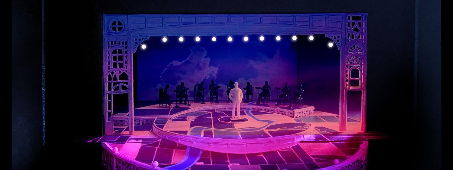
The stage's circumferential layout is my way of rewriting the town square metaphor to reaffirm the Deaf community's instinctual tendencies while socializing: groups often gather in circles to meet, chat, what have you, where everyone is seen and "heard" without sightline issues to contend with. Sometimes there's osmosis between group circles: circles have special symbolism in ancient cultures throughout human history as life-affirming, so it fits here. We're alive, we're here. A more practical benefit to this layout, with its built-in arc ramps, is that it allows for smooth, seamless transitions between scenes, with people moving in and out like...osmosis in action.
Music Man is probably my most optimistic set design yet. It feels unencumbered by the gravity/weight of its production history, its recurring scenic trappings, and conventional architectures associated with the hearing worlds Deaf people find themselves living in, while seeking to encapsulate a forward-looking, can-do American spirit to hold up against this country's complicated and unresolved legacies.
AK: Let's talk more about this visual landscape you’ve created. The set is painted non-realistically, and the floor looks like a bird’s-eye view of Iowa. And additionally, we’re not using a typical wing-drop set–the things we are flying in are a lot less literal.
ES: I knew when I took on this Music Man, with this sense reinforced through conversations with Michael and Sandy, that we wanted to avoid introducing the latest in a long line of conventional wing-drop sets. A reverential museum piece romanticizing American mythology is not the direction we wanted to go in. No town sequences with performers strolling and prancing about downstage of an inert array of literal Main Street storefronts. Although at that time, we did not have any indication of our Music Man would ultimately end up looking like, but even then, we knew exactly what we did not want to do with it.
River City, as the setting and world of this musical, speaks to me as a normal coexistence between Deaf and hearing people within a broader hearing world, with Martha's Vineyard as precedent of its feasibility. Considering how new the coinage of "Deaf space" is and recent architectural efforts to create examples of such, I felt that it probably was more appropriate to showcase a Music Man universe in which its Deaf characters have long adapted existing and recognizable architectural language--and by extension, the semiotics of that broader hearing world they live in, with River City being "safer" than the norm--according to their own Deaf sensibilities as well as natural and navigational orientations. Examples of these sensibilities include, but are not limited to, tendencies toward open plans/spaces and large windows harnessing daylight.
"Iowa Strong"--the idea that its people are one with the land they live on--are at odds with the impermanence of life (and theatre) itself. Life goes on. Nothing is forever. There are lives to be lived and worlds to be adventured beyond the safe confines of River City, and the outsider Harold Hill offers these possibilities with his arrival.
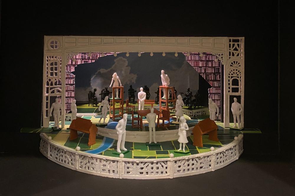 Image credit
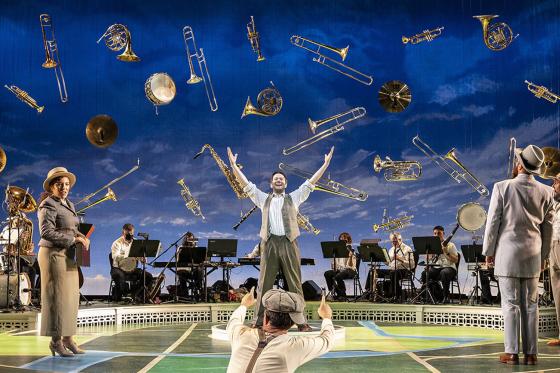
This was the impetus behind the artistic decision regarding the floor treatment, the visual landscape as you call it. It's intentionally representative of the Midwest as seen from above: a sprawling pattern of farmland parcels interrupted only by a river slicing through it, and it's meant to evoke one of the oldest forms of American folk arts, the quilt. What's more, gazing down from that vantage point, life seems so much more all-encompassing than River City itself, rendering the idea of whether its citizens are Deaf or hearing as unimportant.
Harold Hill, in this production, arrives, expecting this town to be a bunch of backward hearing rubes conditioned to think of Deafness as half novelty half stigma, thinking he could easily bamboozle them, capitalize on their attitudes toward Deaf people, which is pretty consistent with the fact American history is rife with anecdotes about self-serving charlatans and swindlers. He thinks, [ASL: me exploit sell convince them DREAM], [ASL: grab money], [ASL: peace out] [ASL: next town let's go]. He may be doing this out of some combination between self-interest and survival as a Deaf person finding his way through different variations of hearing worlds. He gets to River City and he realizes this is not the case. These people are thriving! Deaf people are thriving here, hearing people are thriving here, and they’re a community of neighbors underpinned by a healthy and strong sense of Deaf identity and pride. For Harold Hill, this is the first time he recognizes, just maybe, there’s a place he can potentially belong. Maybe Harold Hill has been on an unconscious quest for a place where he feels he belongs--we are free to speculate on his backstory prior to his arrival in River City. This could be the first time, after so long on his journey, Harold Hill gets to experience that feeling of finally being home, where he belongs, able to connect with others like himself...where everything seems to click. Many of us who identify as Deaf can relate.
People in small towns are known to be wary of strangers coming into town. Who is this new person? What are they doing here? That wariness is not all that different from a local Deaf community's quickness to perk up if it does not recognize another Deaf person at a favorite hangout familiar to Deaf locals: Wait a minute, who’s that? Who are they? How did they find out about this place? There may be a moment of sizing one another up, and I was keen to give a sense of that from Harold Hill’s perspective upon his arrival in River City. These similarities led to the conception of the portal as a frame consisting of windows as statements of personalities, with no one window replicating another. Central to the portal's symbolism was the understanding that what makes a town is not necessarily its collection of physical buildings, but rather, its people, who call it home. Following that logic, it is reasonable to expect that River City would be guarded against strangers, and it is through these windows--literal and metaphorical protective barriers--that its citizens interact with Harold Hill. For Deaf people, sight is typically the most important sense out of the four (not five) on hand, and there's that saying about the eyes being windows into souls.
Furthermore, there are several actor-manipulated window units that were experimented with by the ensemble during rehearsals, with final configurations coming about organically: the idea behind these units is to achieve different configurations and looks for the town to be integrated within choreographed sequences and transitions. It's the psychology of exploring and navigating a new place as an interactive, three-dimensional environment: it is the goal for scenes taking place in the town to feel as though they are taking place in different parts of it....the coming, the here, the going. The town is its people, and the people are the town.
In regard to the fly-in elements you referenced, they are my attempt to reorganize and recode architectural semiotics by placing them in specific sequences that suggest a broader stream-of-consciousness, stripping each traditional location (town, library, gym) down to visual marker elements associated with feeling and memory linked to moment and place, as opposed to historically accurate reproductions of entire buildings and facades. The abundance of antique and memorabilia shops along America's highways tells me that this nation is infatuated with its ephemera, the stuff of feelings and memories coloring the American ideal in more ways than one. Music Man may be a quintessentially American musical, but the slice of America it represents in this production is very much a forward-looking and hopeful one in light of past, present, and unresolved national traumas.
AK: And I love how that emphasizes how Harold comes in and sweeps everybody away with his narrative, with his con. I think that your set truly reemphasizes and elevates the story in a way that I haven’t seen before. I’m really excited, thank you for taking the time to chat with me about it
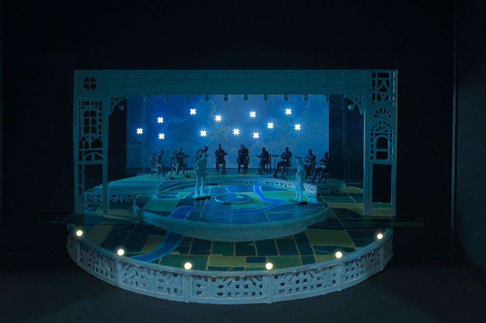 Image credit
